Before
Glow of Pink
This case study shows how the Glow of Pink website was upgraded from a generic template into a more polished storefront with stronger branding, clearer structure, and more intentional customer-facing presentation.
Project Overview
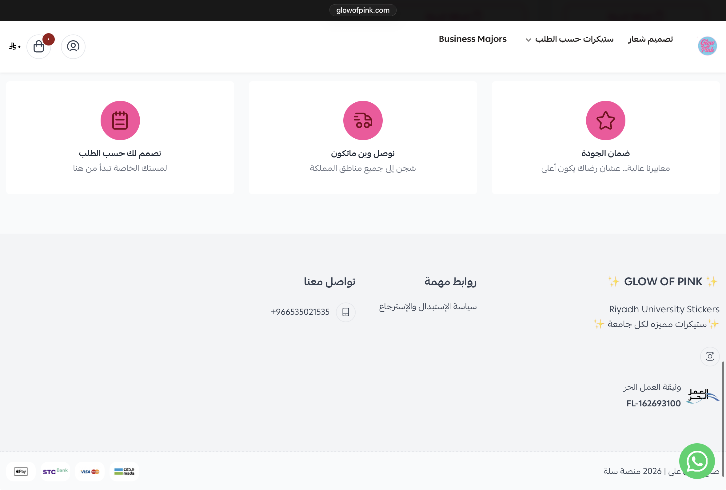
The original storefront looked template-driven, with limited brand personality and a weaker visual hierarchy across key sections.
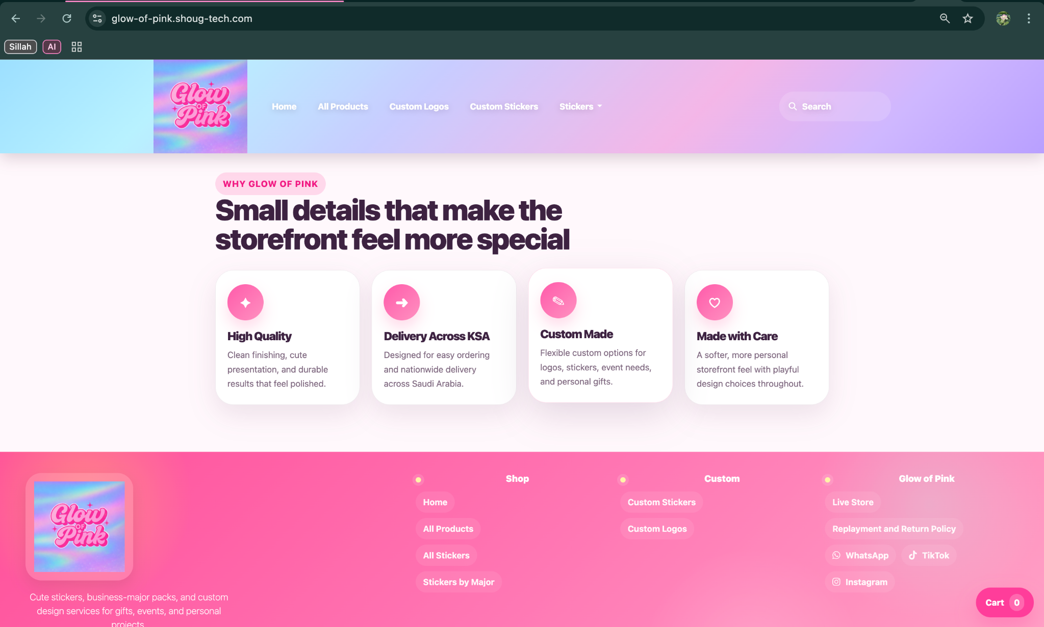
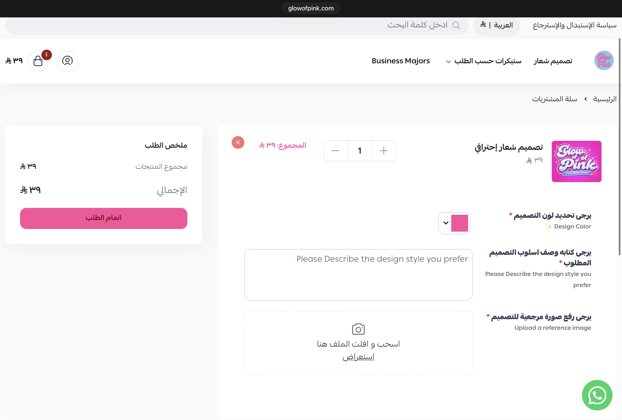
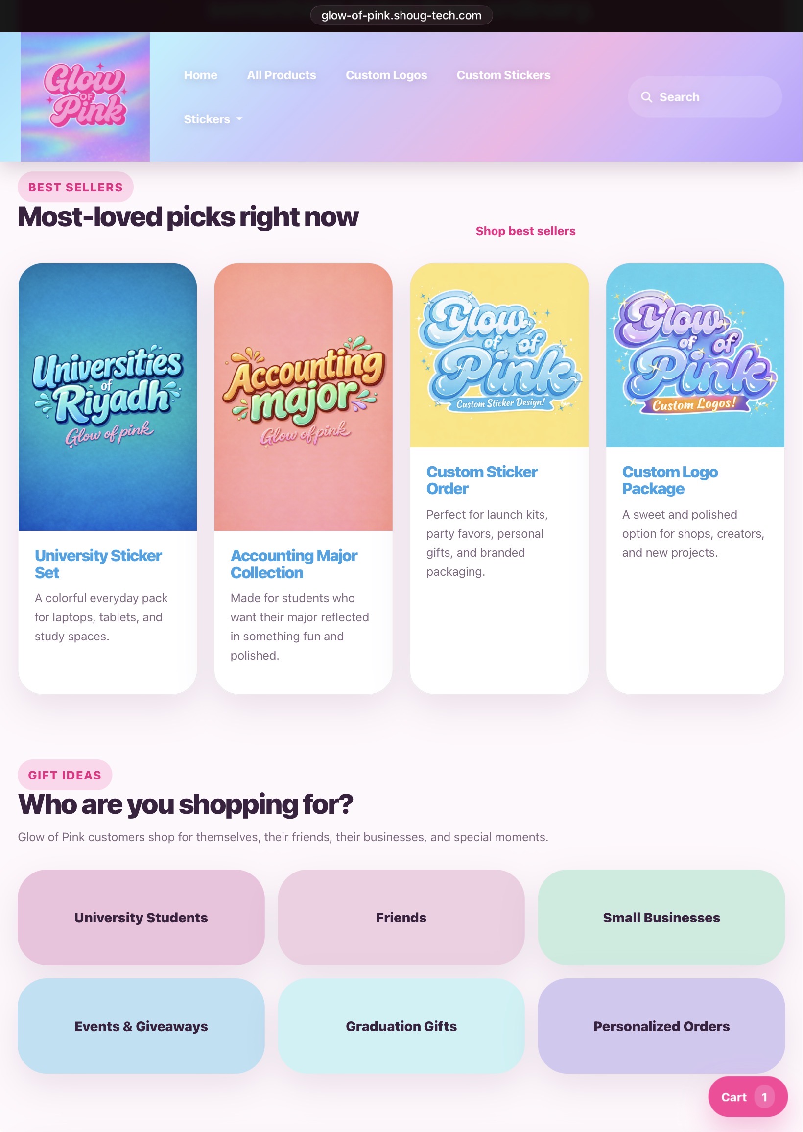
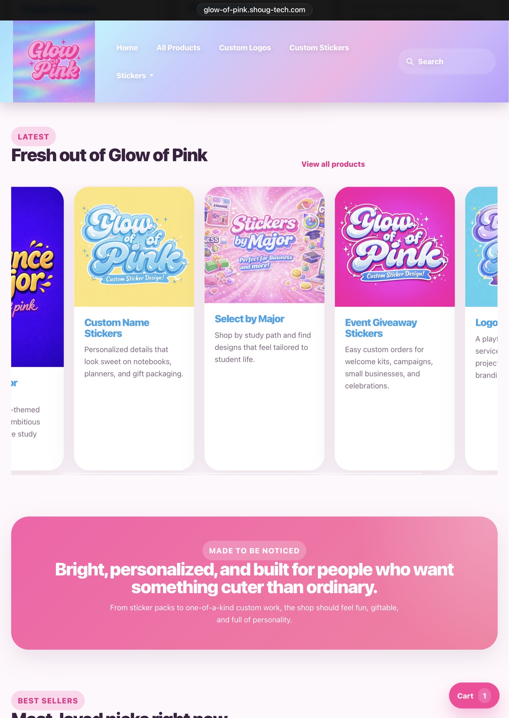
The redesign introduces more deliberate typography, improved spacing, and a clearer customer journey to create a stronger brand impression.
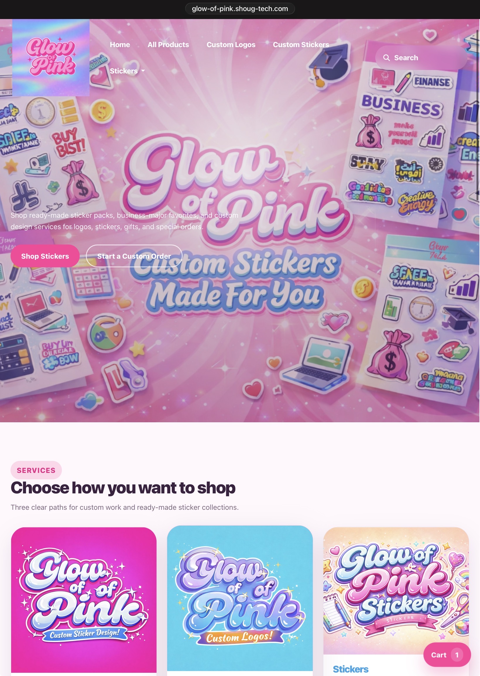
The final result feels more like a polished boutique storefront than a default catalog template.
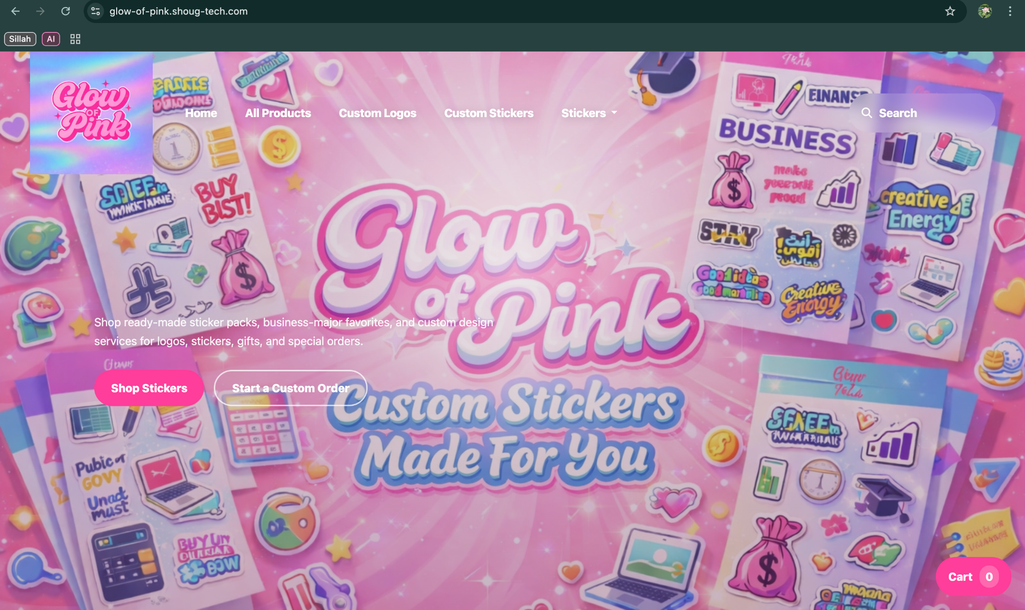
Before and After
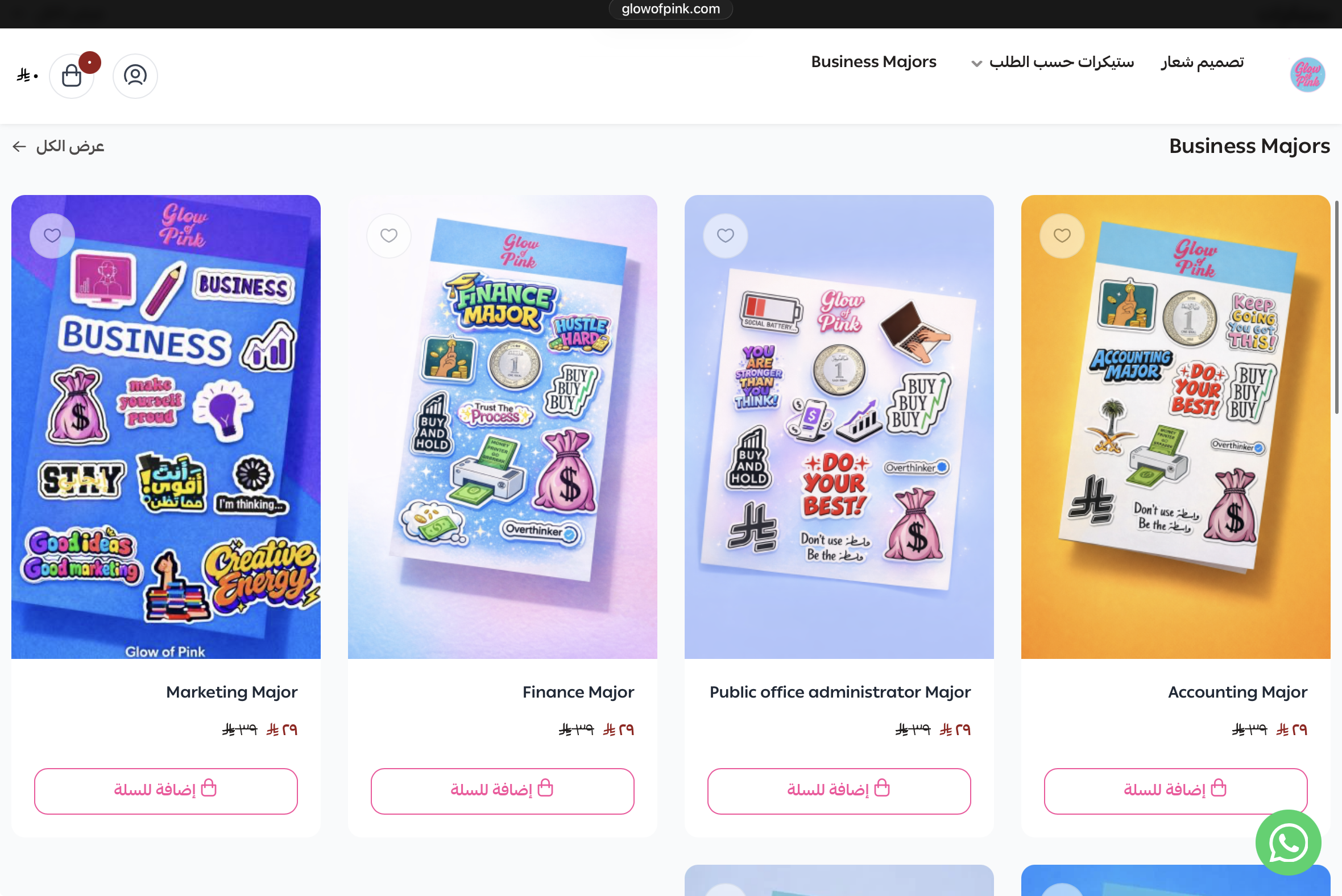
The original site relied on a standard storefront structure with tighter spacing, weaker hierarchy, and a look that did not fully support the brand's personality.
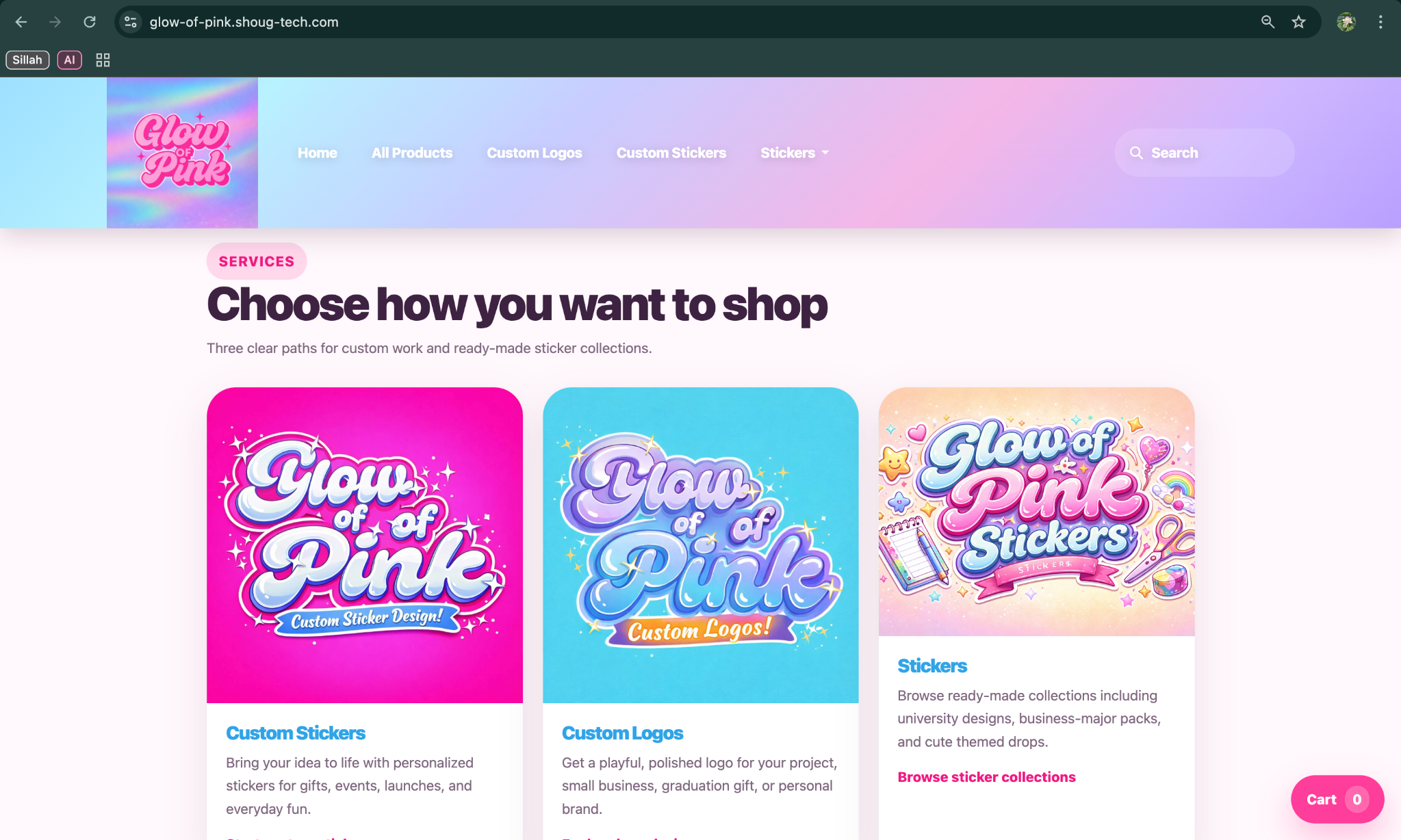
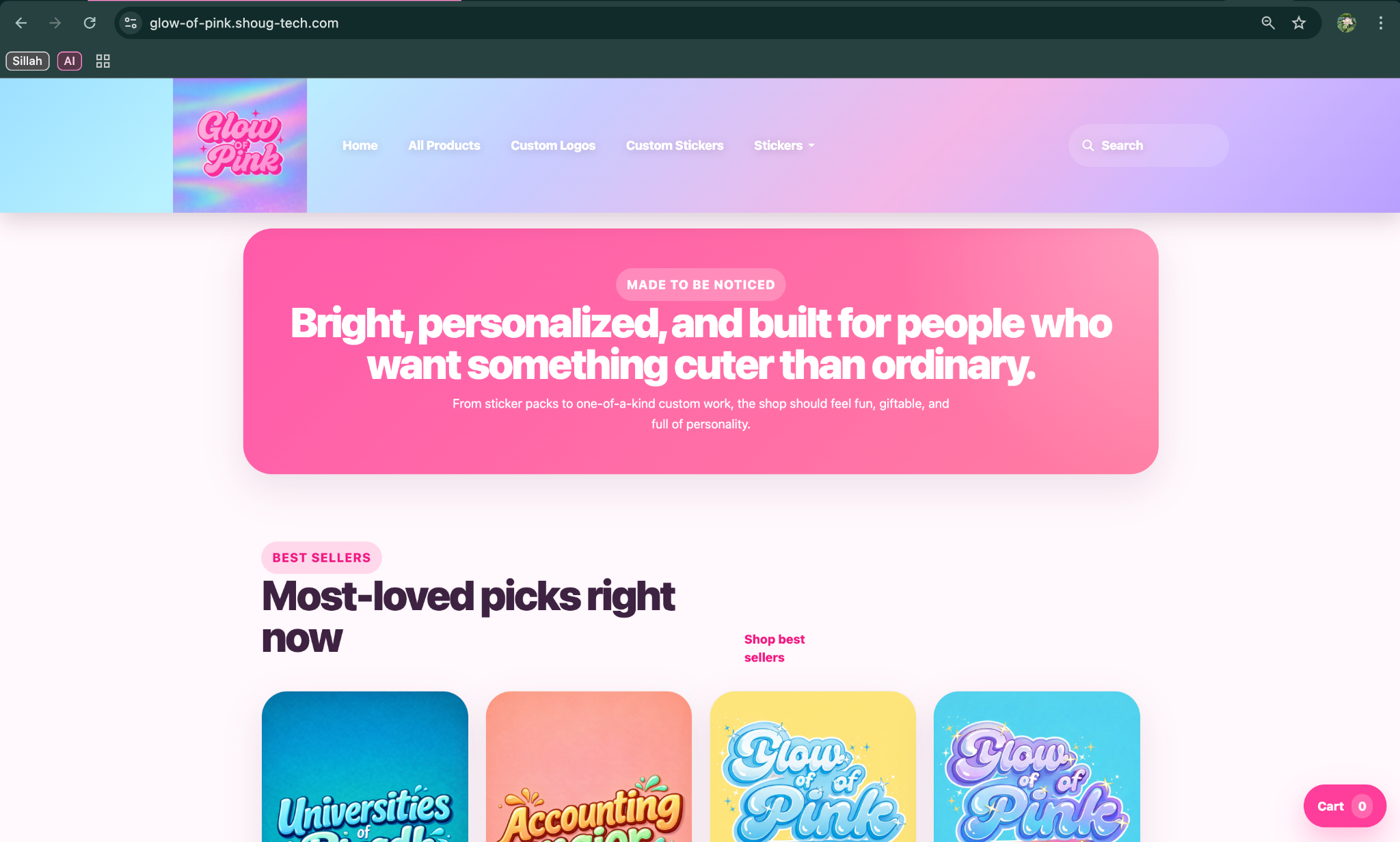
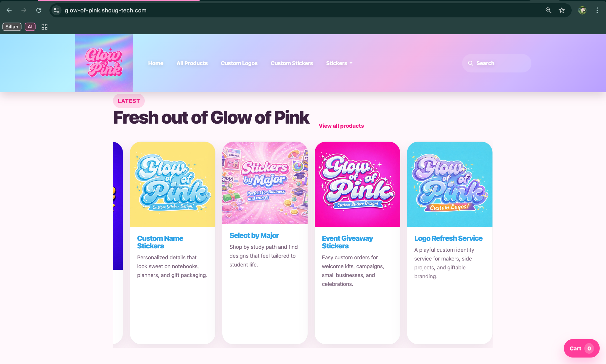
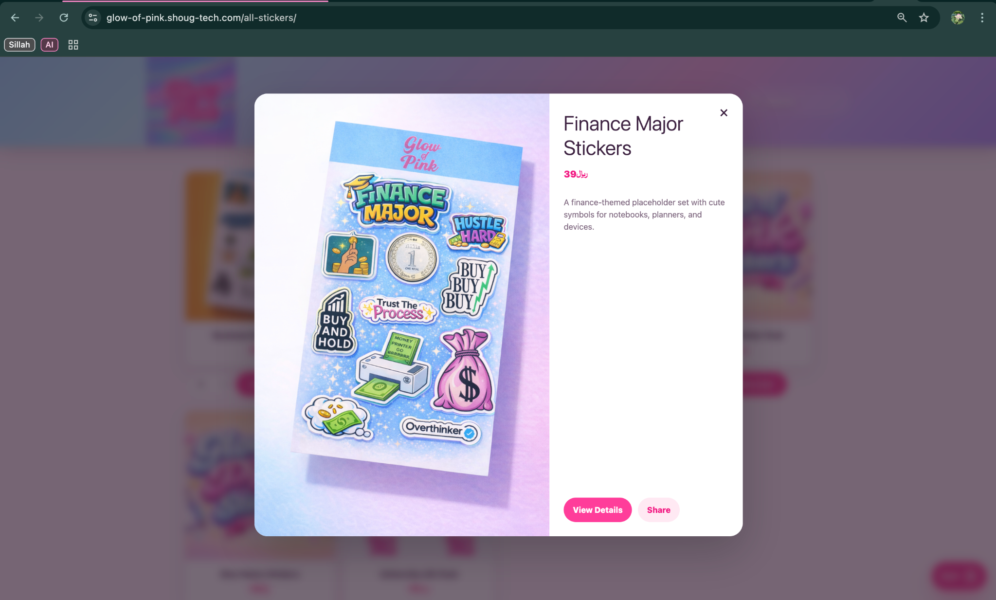
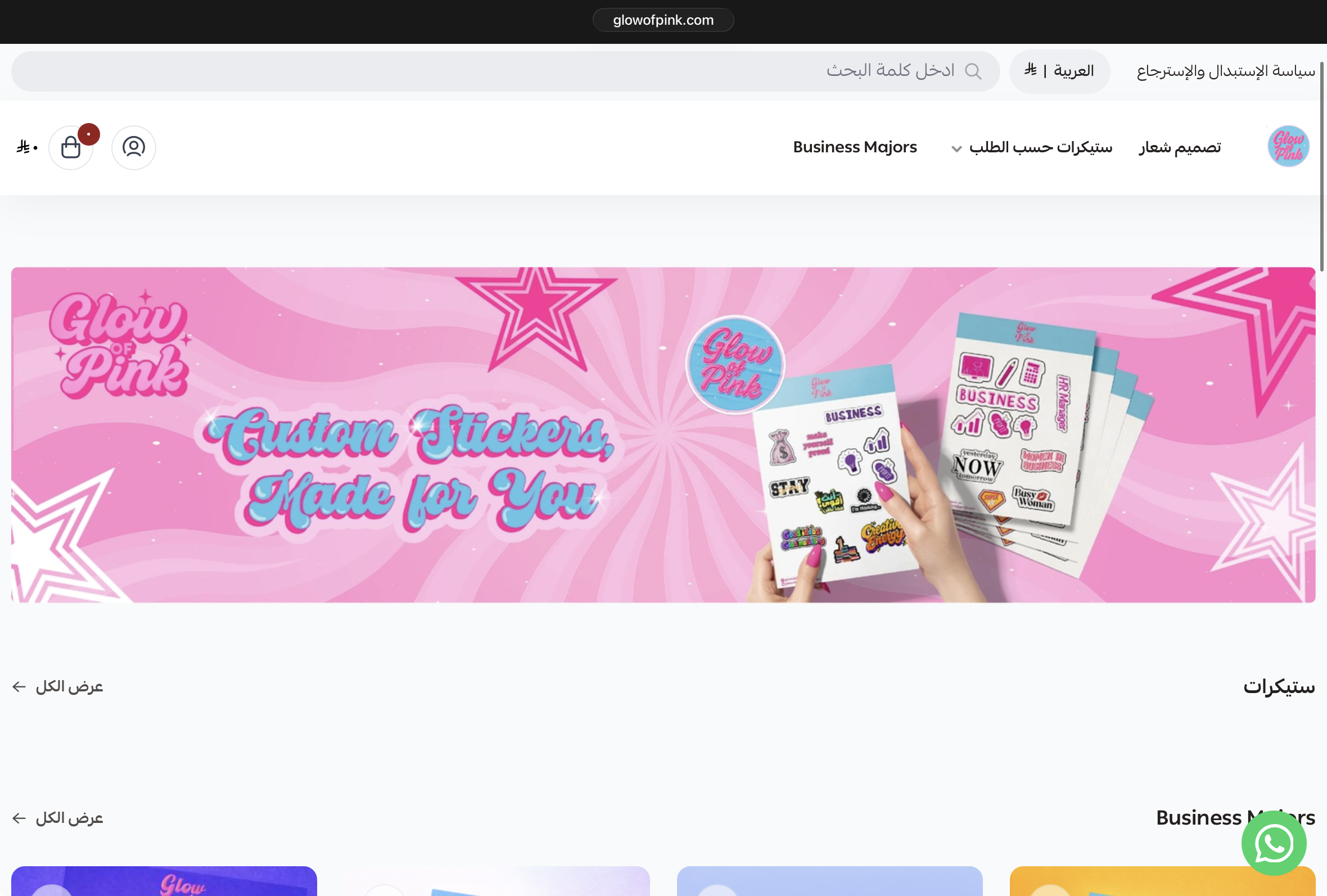
The updated concept brings a stronger hero composition, better section pacing, and a more intentional boutique feel that immediately reads as more custom and brand-aware.
Device Showcase
On phones, selected galleries turn into swipeable rails. Tap any screen to open it, then zoom in for a closer look.
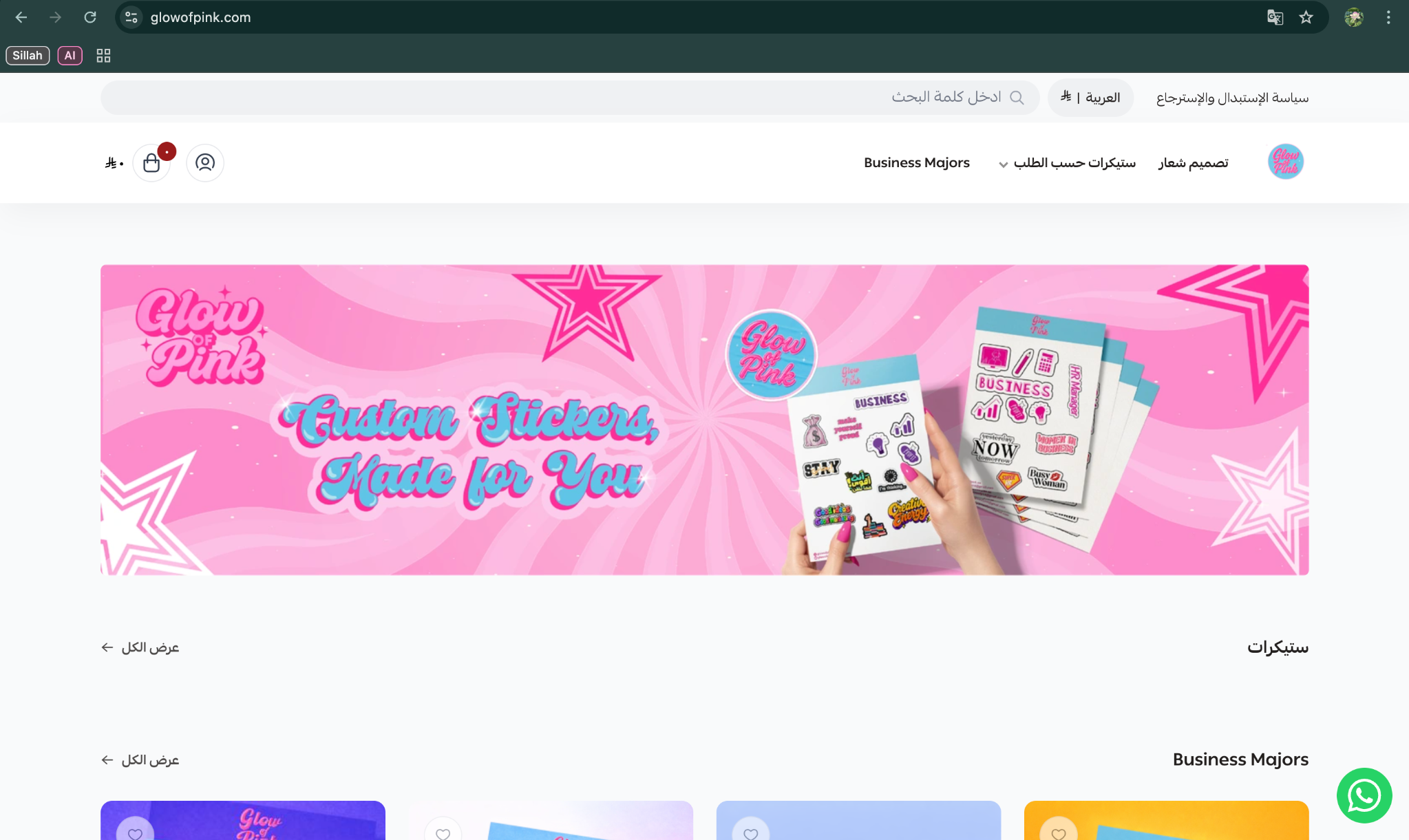
These desktop captures show the original experience before the redesign improved hierarchy, section pacing, and brand presentation.
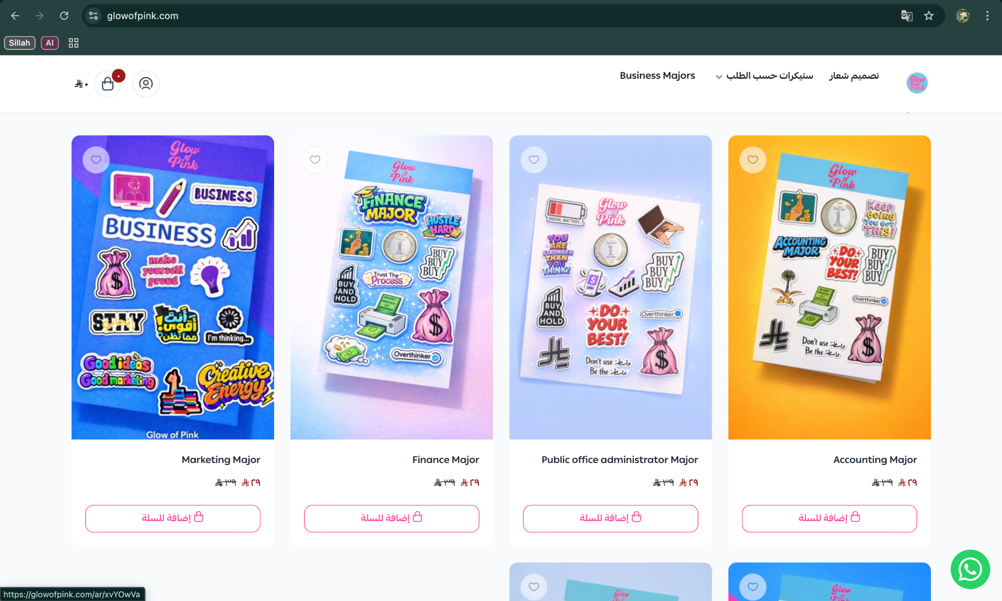
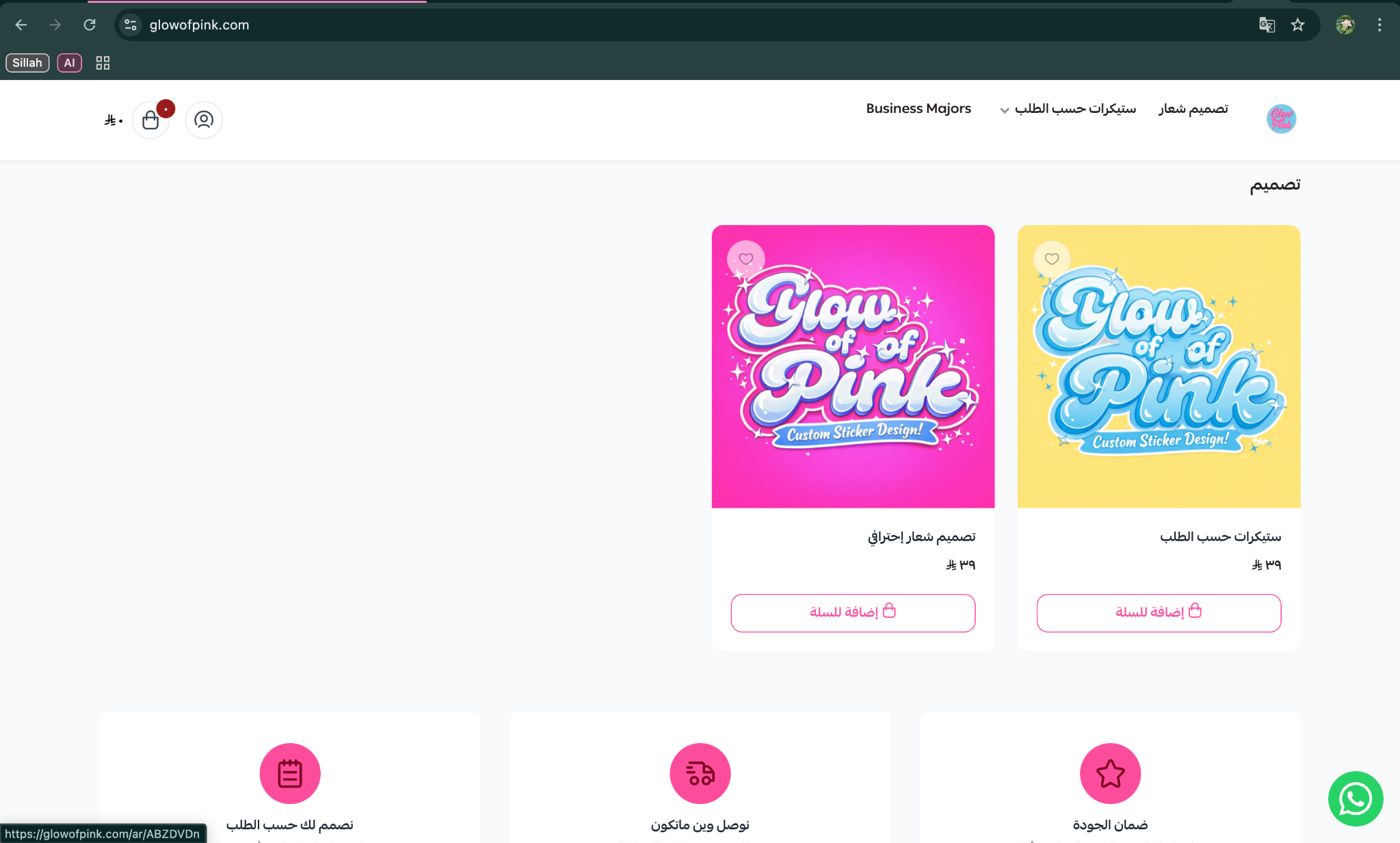
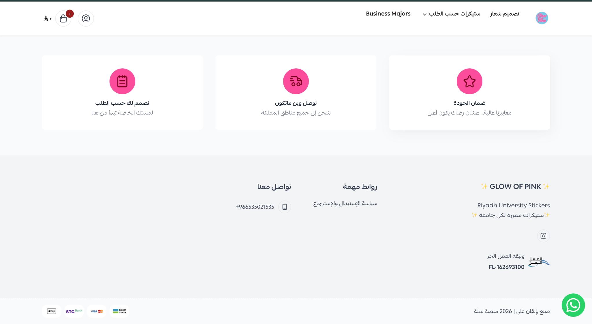
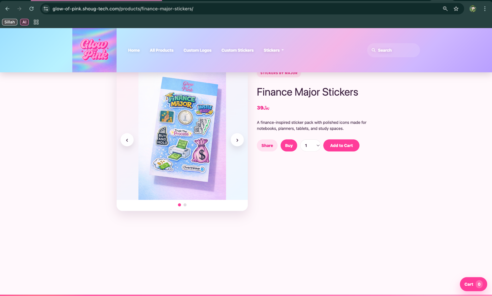
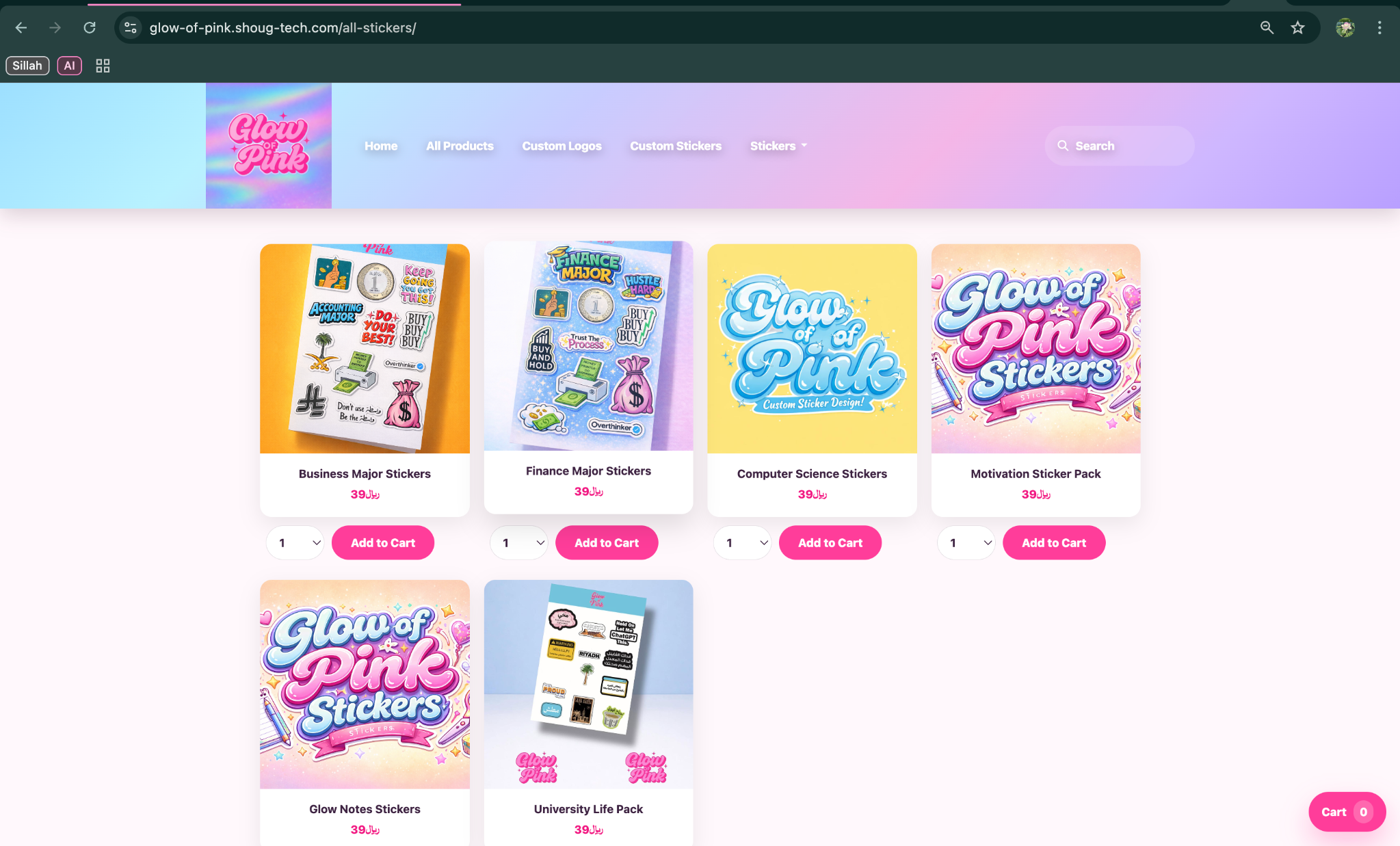
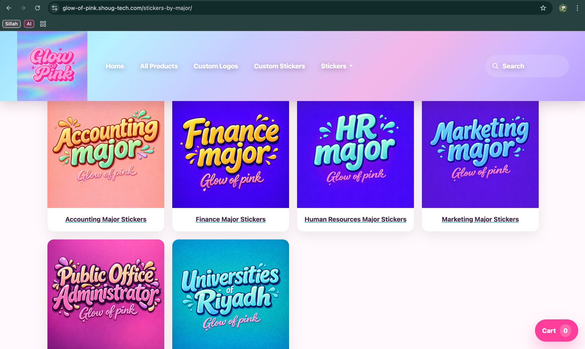
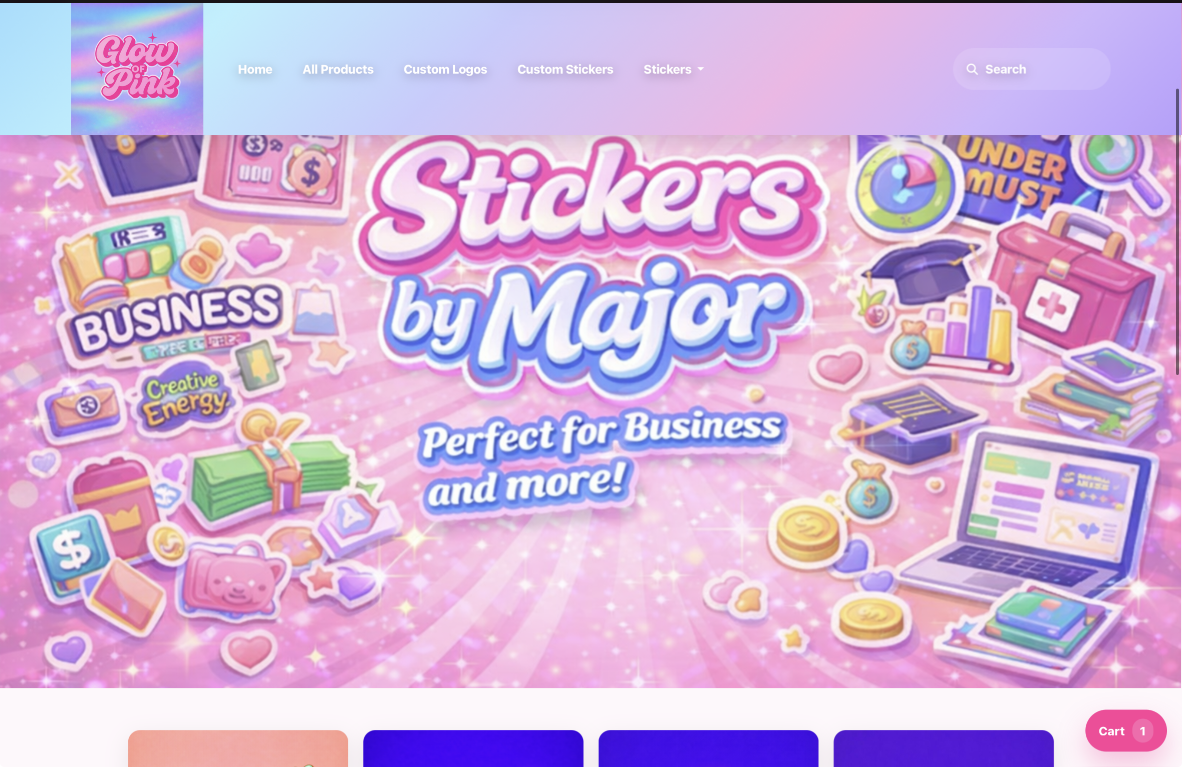
The laptop views show the full storefront transformation with broader layout improvements, polished banners, and stronger visual flow across the shopping journey.
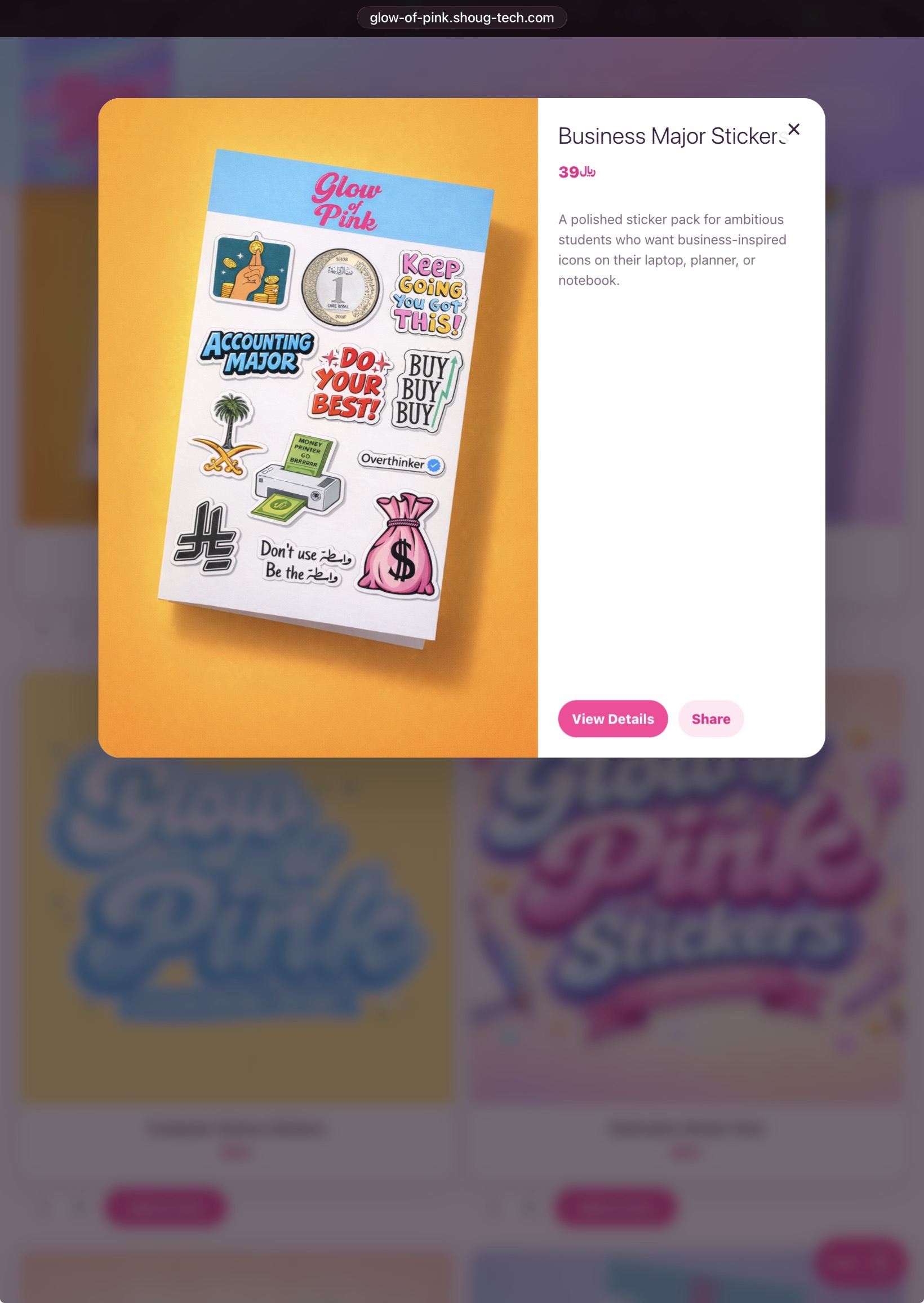
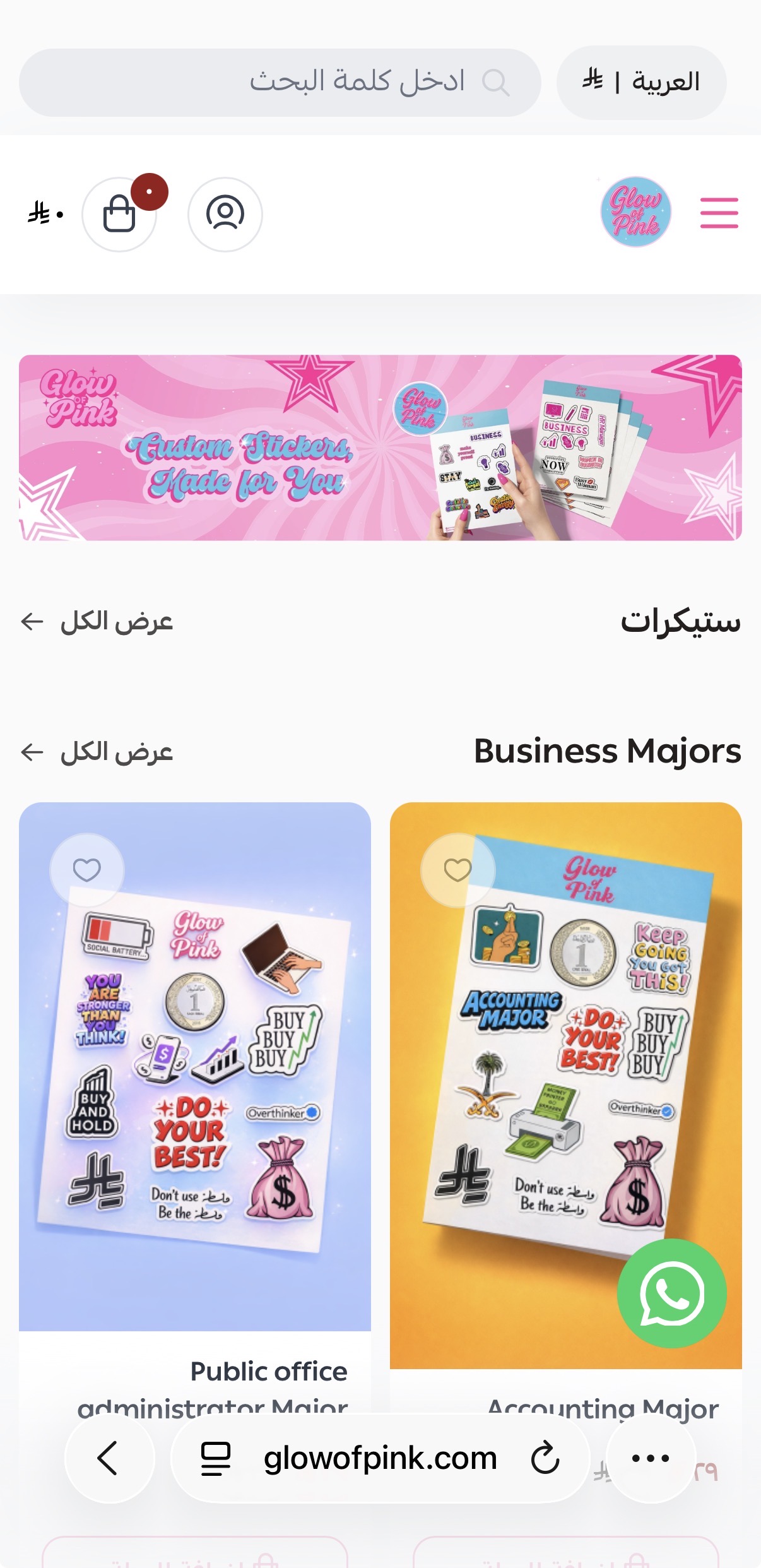
The original iPad experience shows the earlier storefront structure before the redesign improved hierarchy, navigation, and content rhythm.
A compact tablet archive that surfaces the key journey points first so the weaker experience is easier to compare against the redesign.
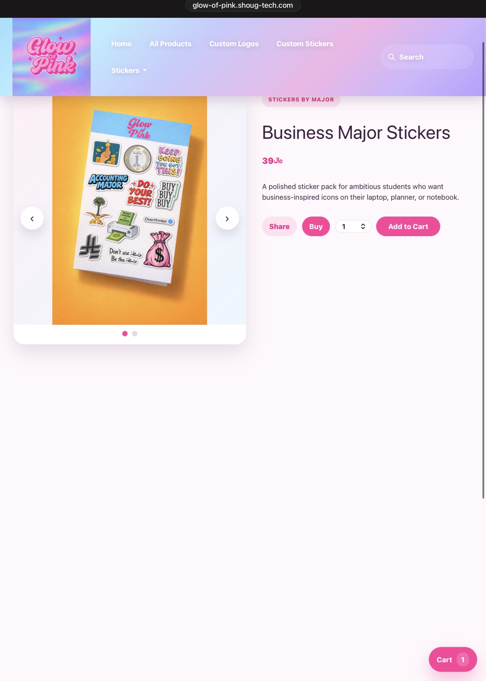
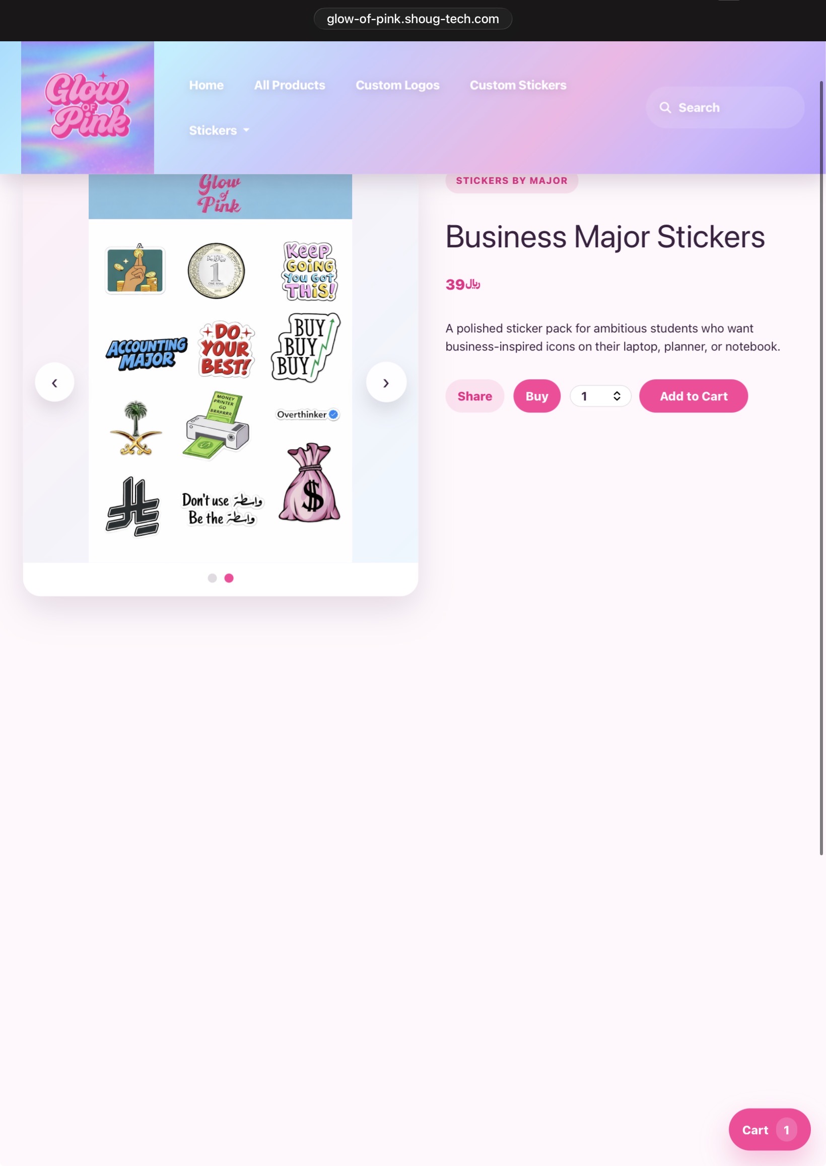
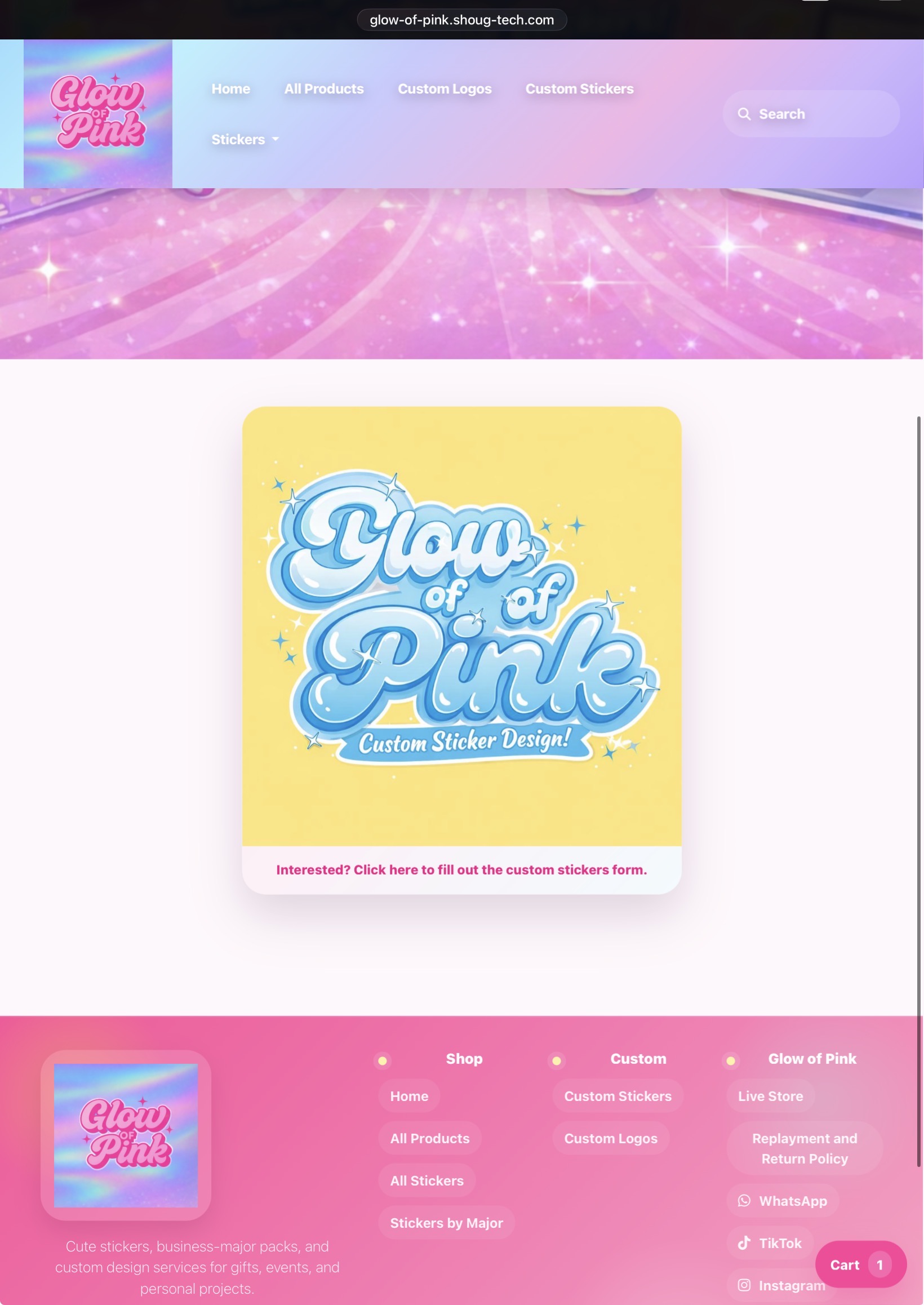
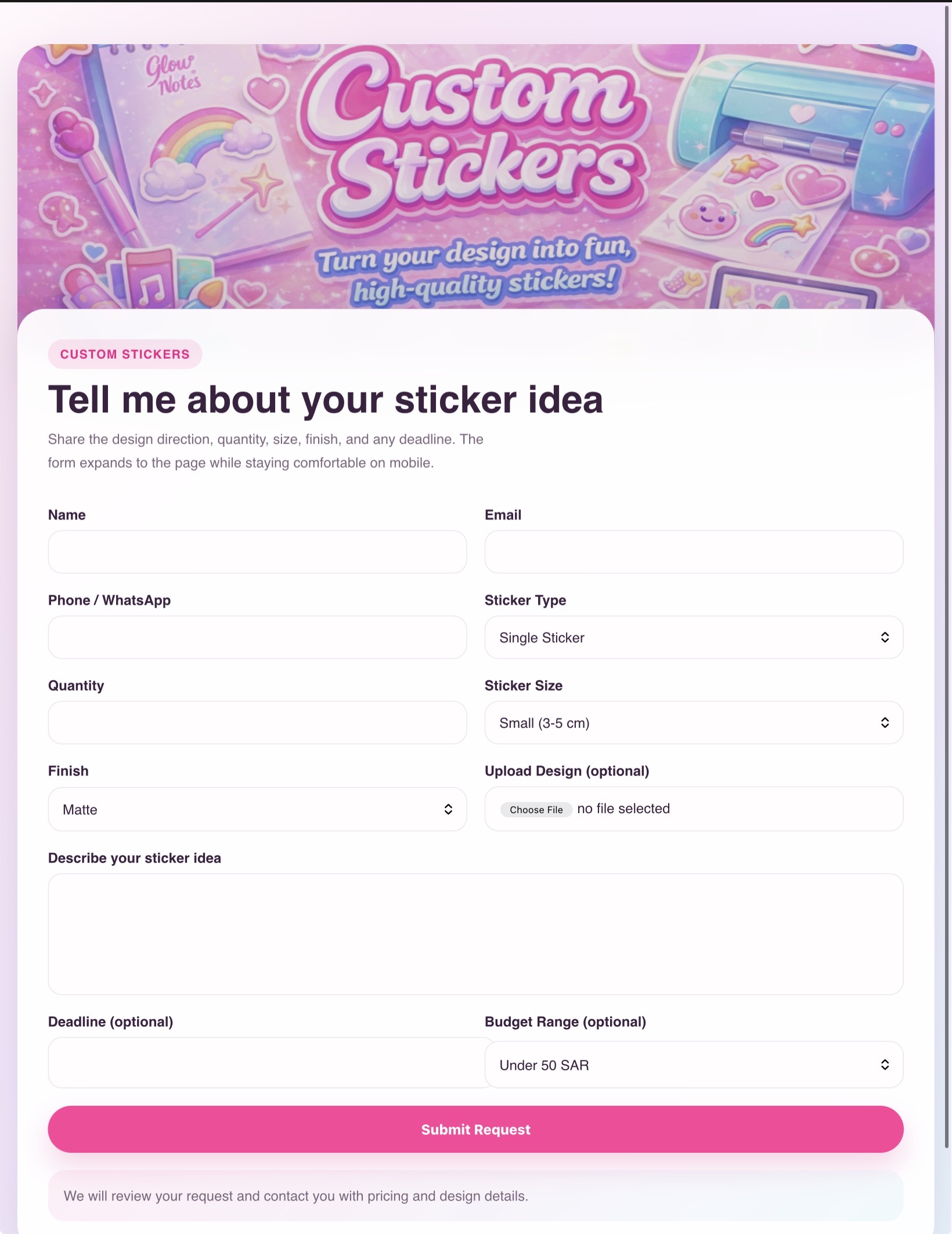
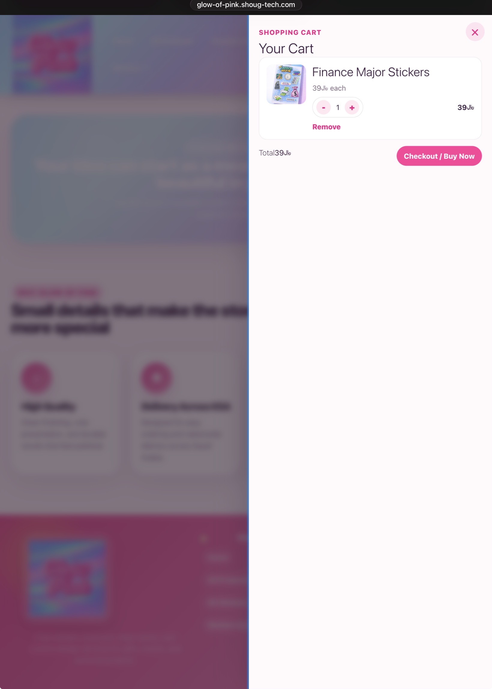
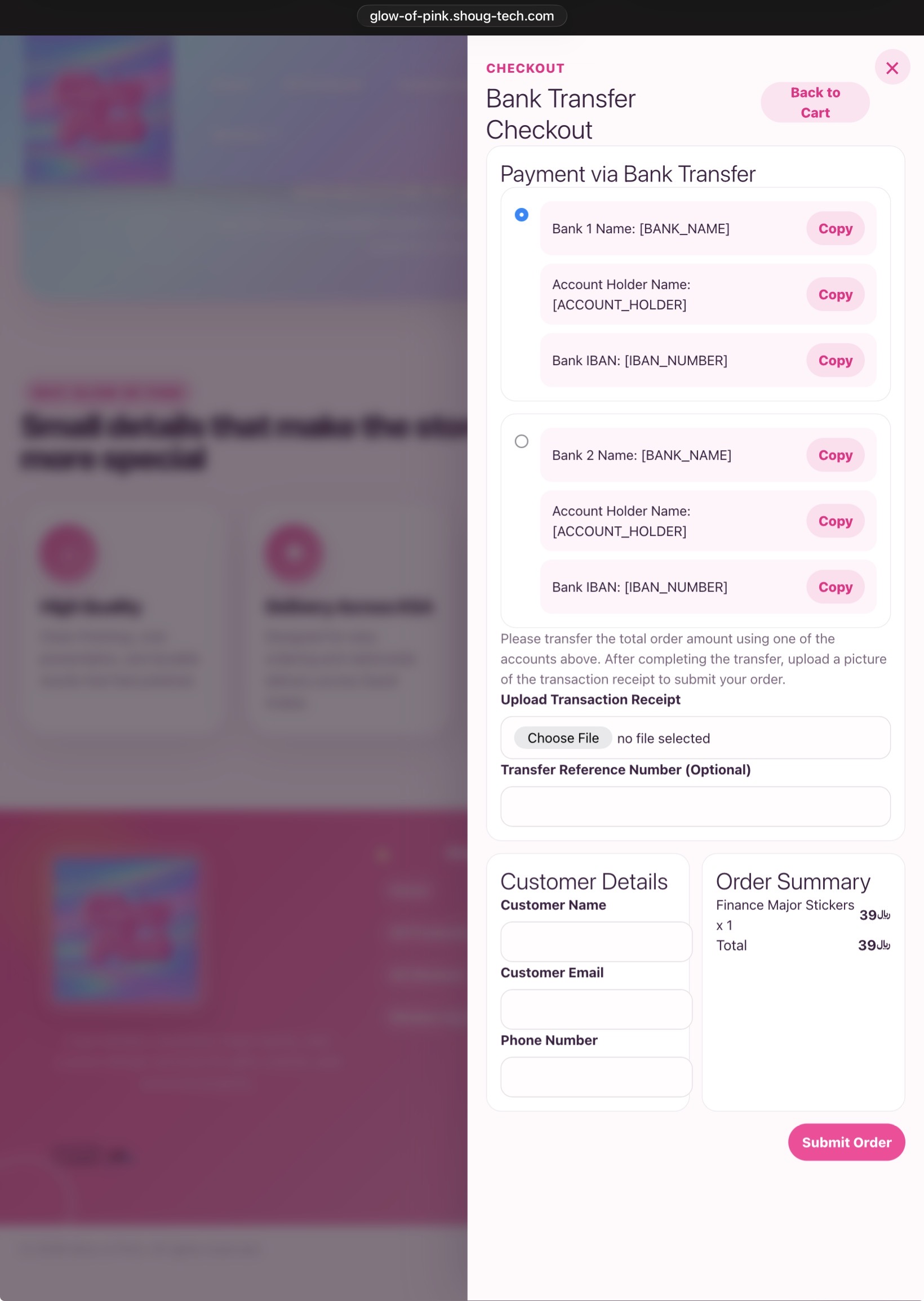
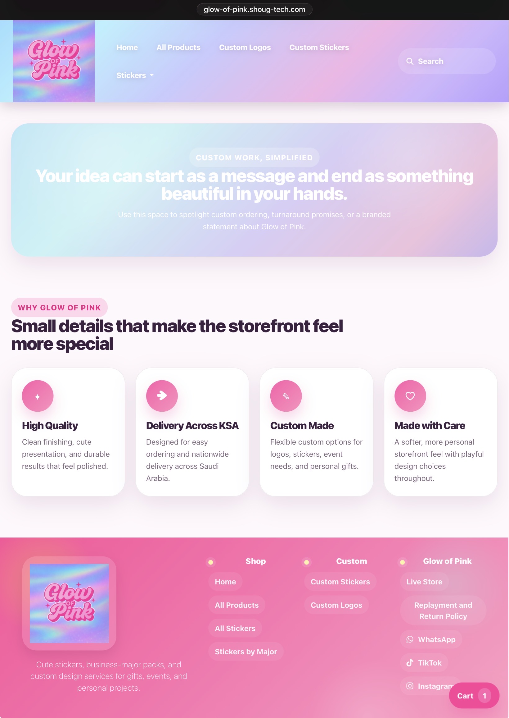
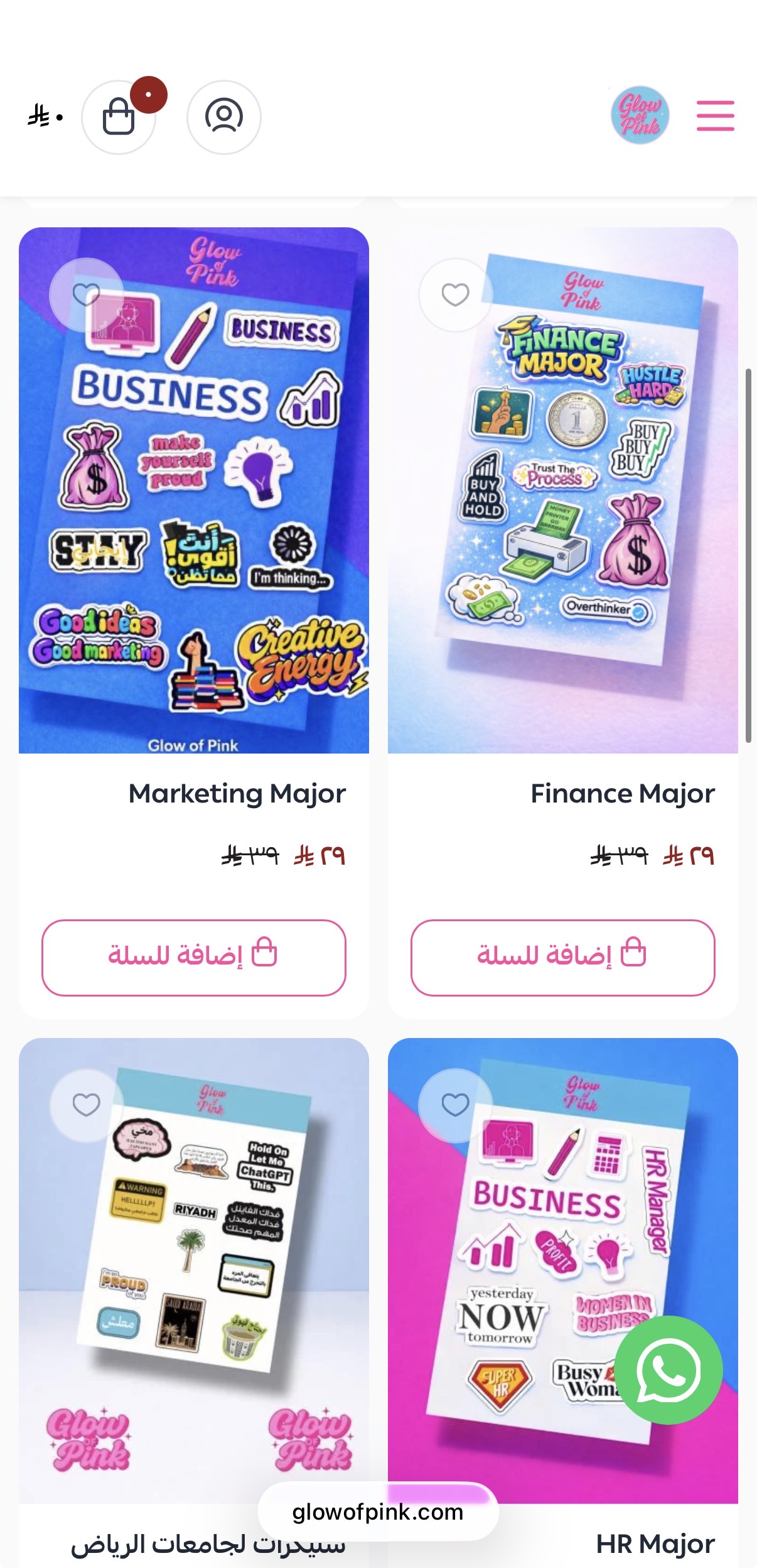
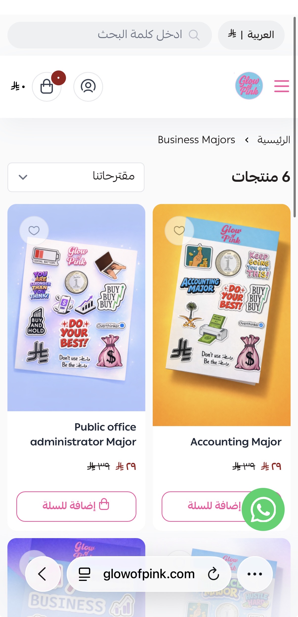
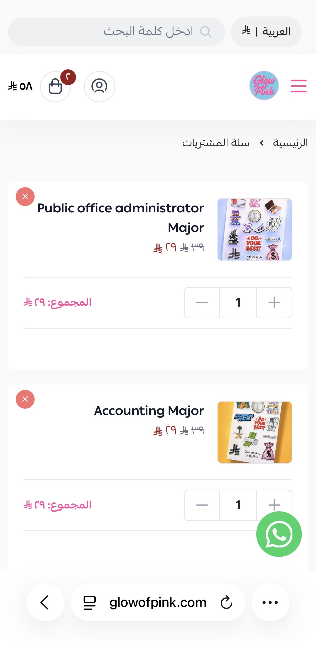
The updated iPad views show cleaner navigation, more polished product presentation, and a storefront flow that feels more custom and editorial.
The refreshed iPad gallery leads with the strongest hero screen, then moves through navigation, product detail, form, and purchase moments in a cleaner order.

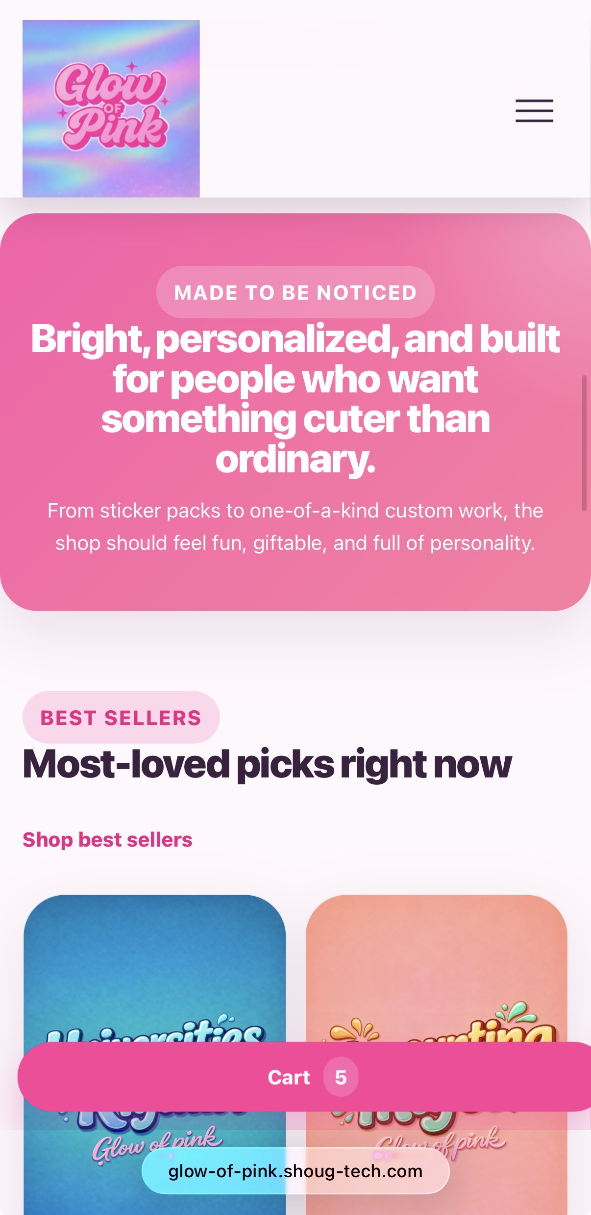
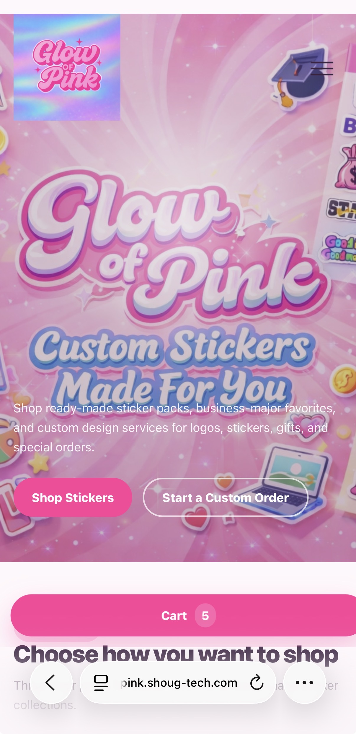
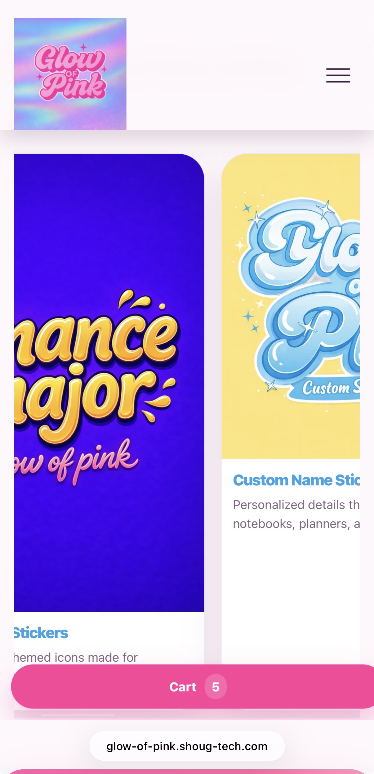
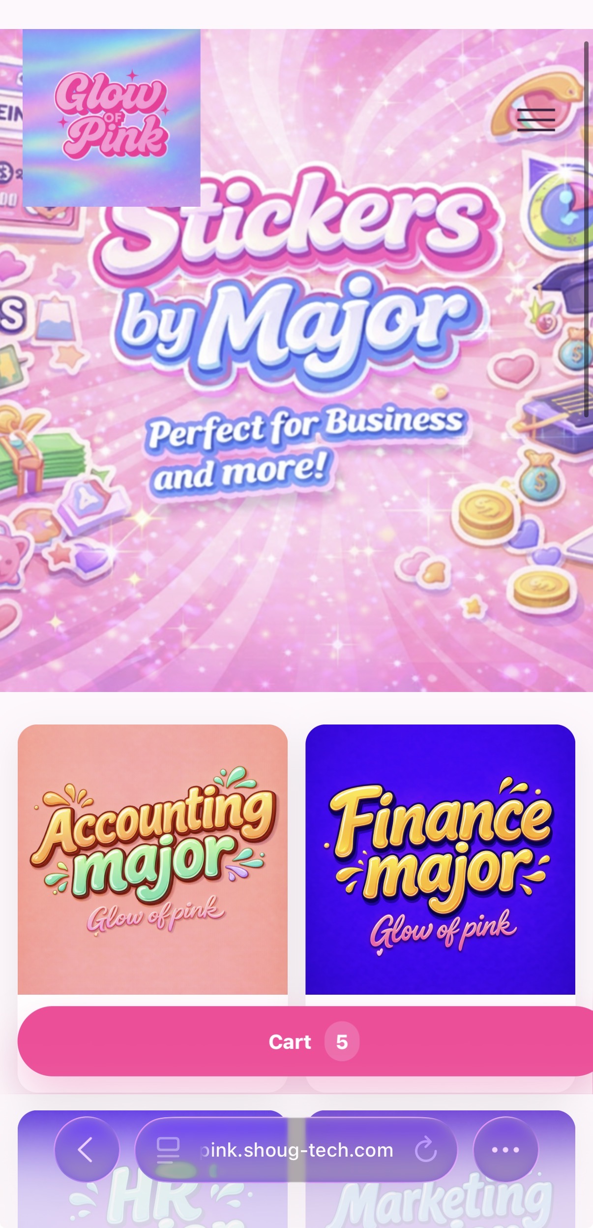
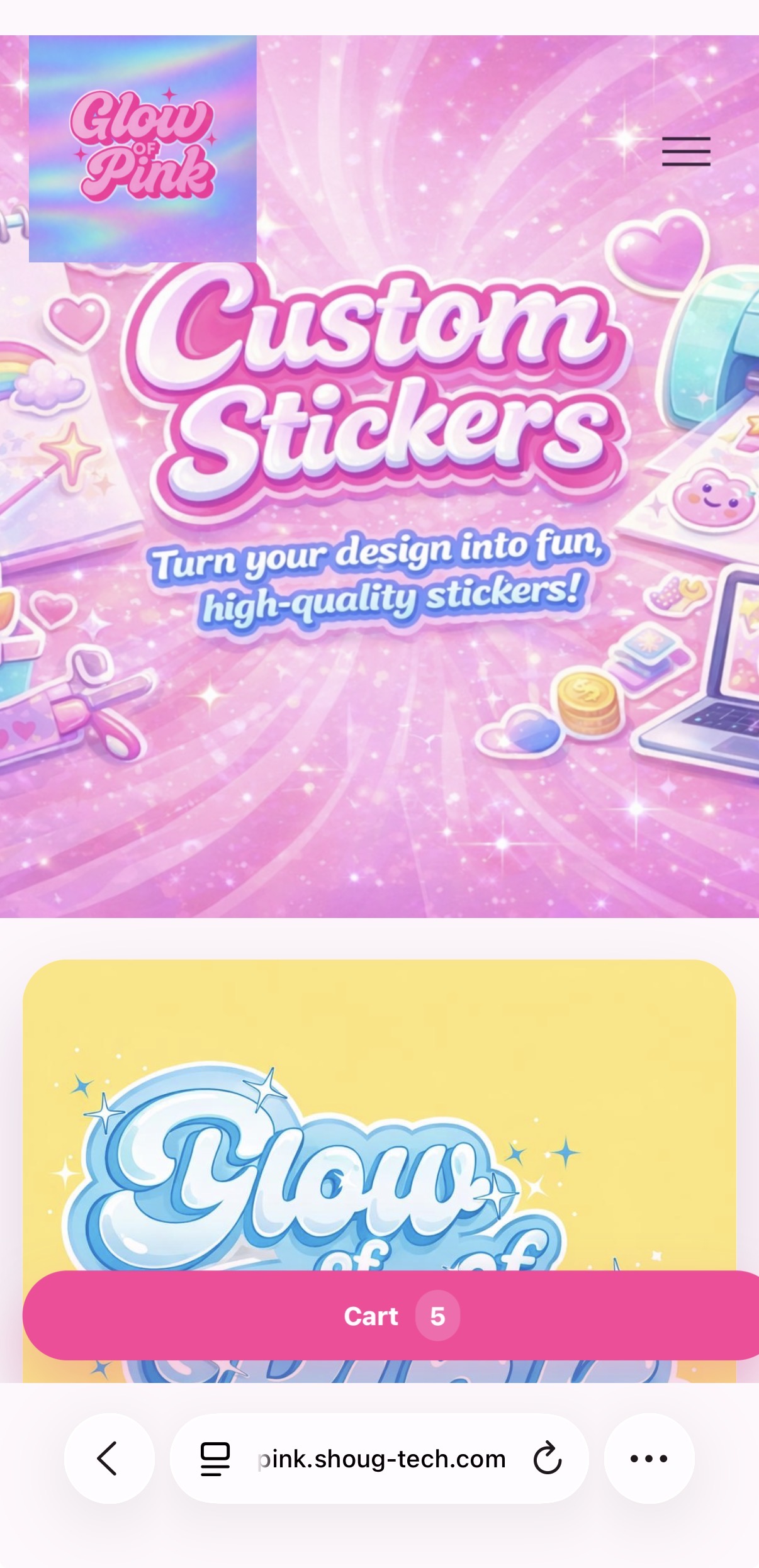
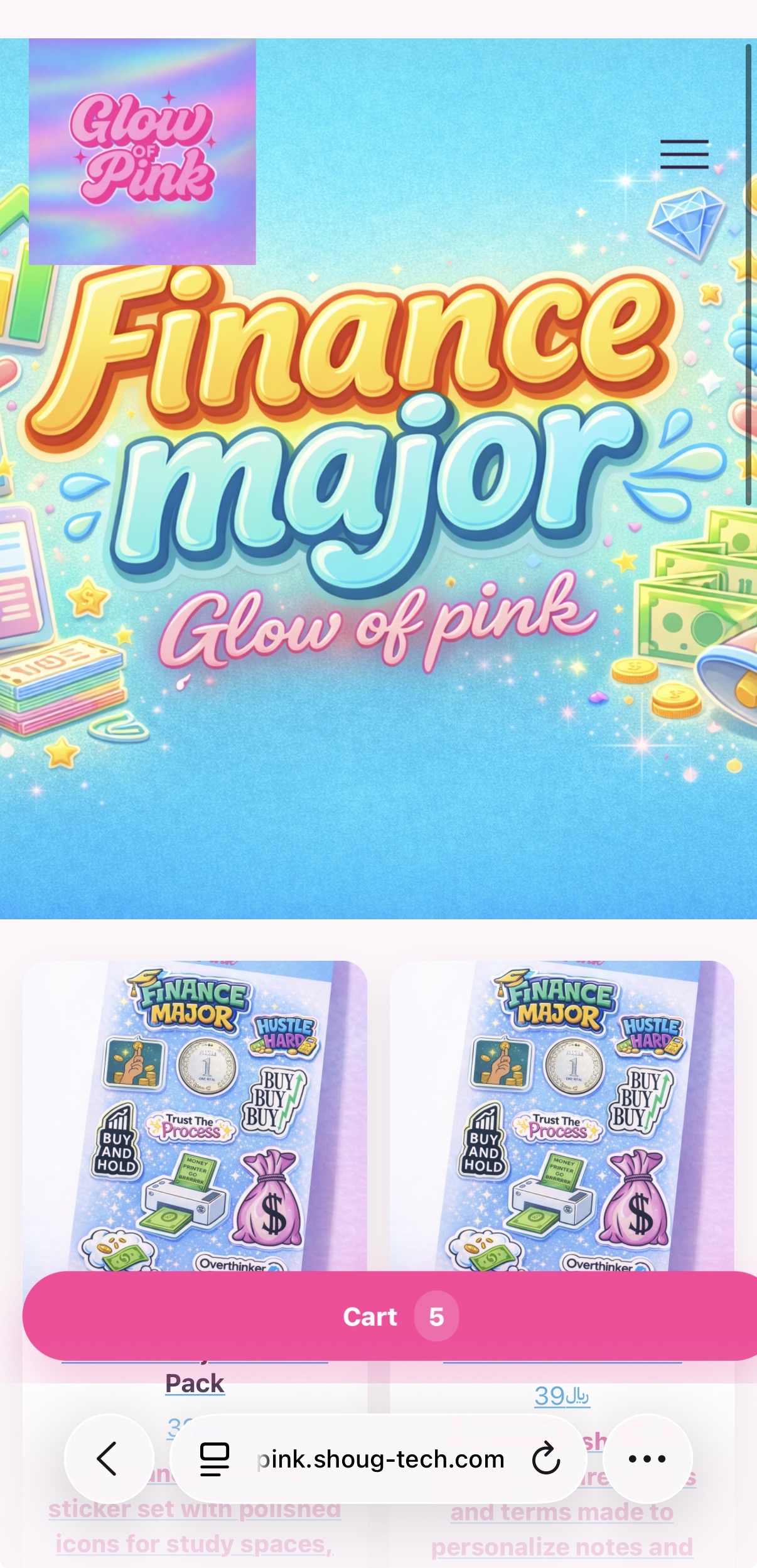
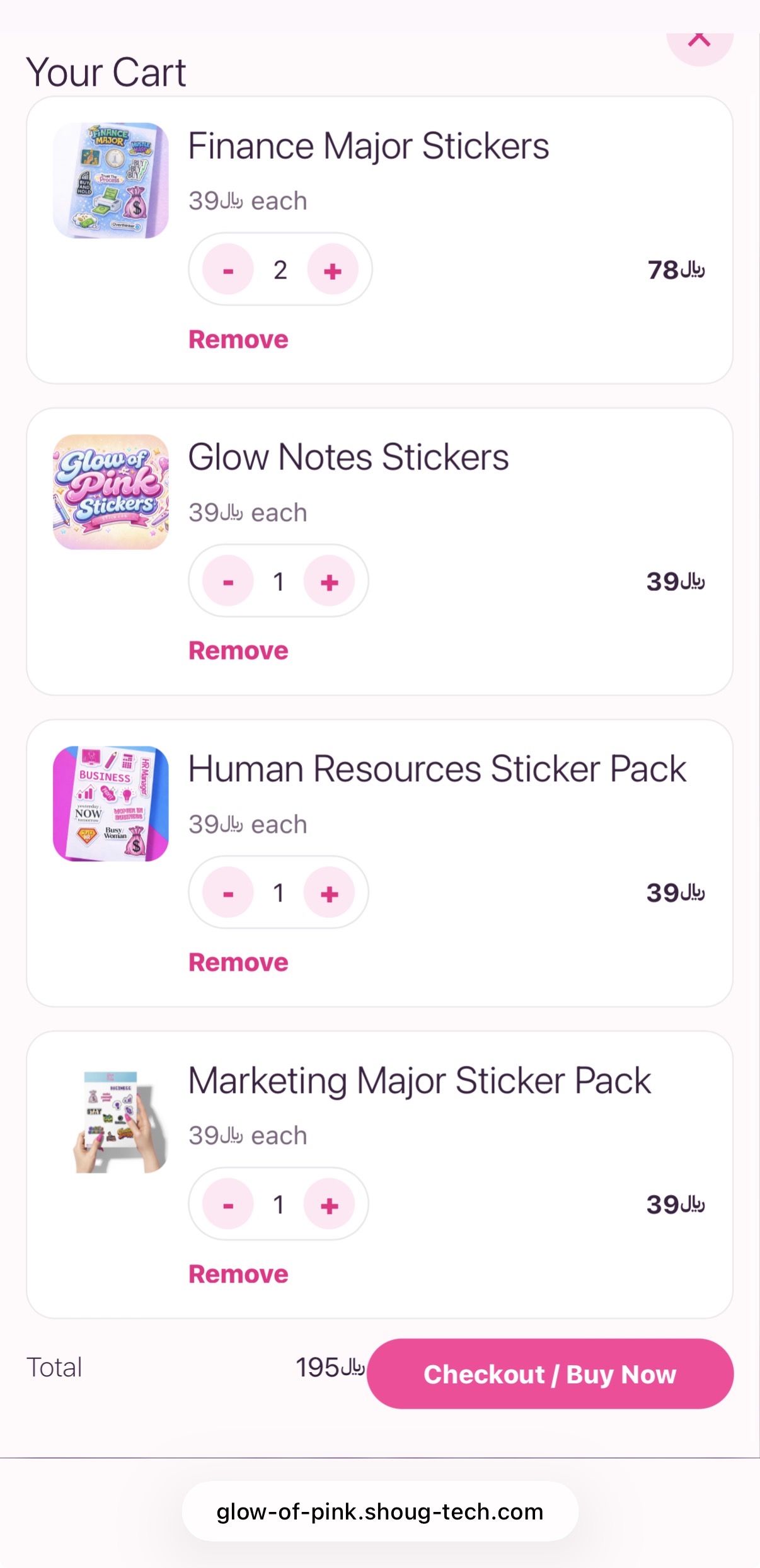
The pre-redesign mobile screens show the earlier navigation and product flow before the experience was tightened for smaller screens.


The redesigned phone screens emphasize clearer sections, improved navigation, and a stronger mobile-first storefront experience.